Mastering dark mode design: essential tips for modern interfaces 🌙

Written by
Fluffys Team
Published on January 21st, 2025
Ready to explore one of the most fascinating challenges in modern UI design? Dark mode interfaces have transformed from a simple color swap into a fundamental aspect of contemporary design. For digital products, dark mode has become a cornerstone of exceptional user experience. 🎨
Why dark mode matters now more than ever 🐈⬛
Dark mode isn't just about aesthetics (though it does look incredible). With more designers and clients working late hours, and users becoming increasingly conscious about eye strain, dark mode has evolved from a nice-to-have feature to a crucial design consideration.
Our community at Fluffys has been experimenting with dark mode designs, and we've gathered some game-changing insights that will transform how you approach this design challenge.
The foundation: color selection
Let's start with the basics — and no, we're not talking about just inverting your colors! The key to successful dark mode design lies in understanding how colors behave in dark environments.
The base color rule
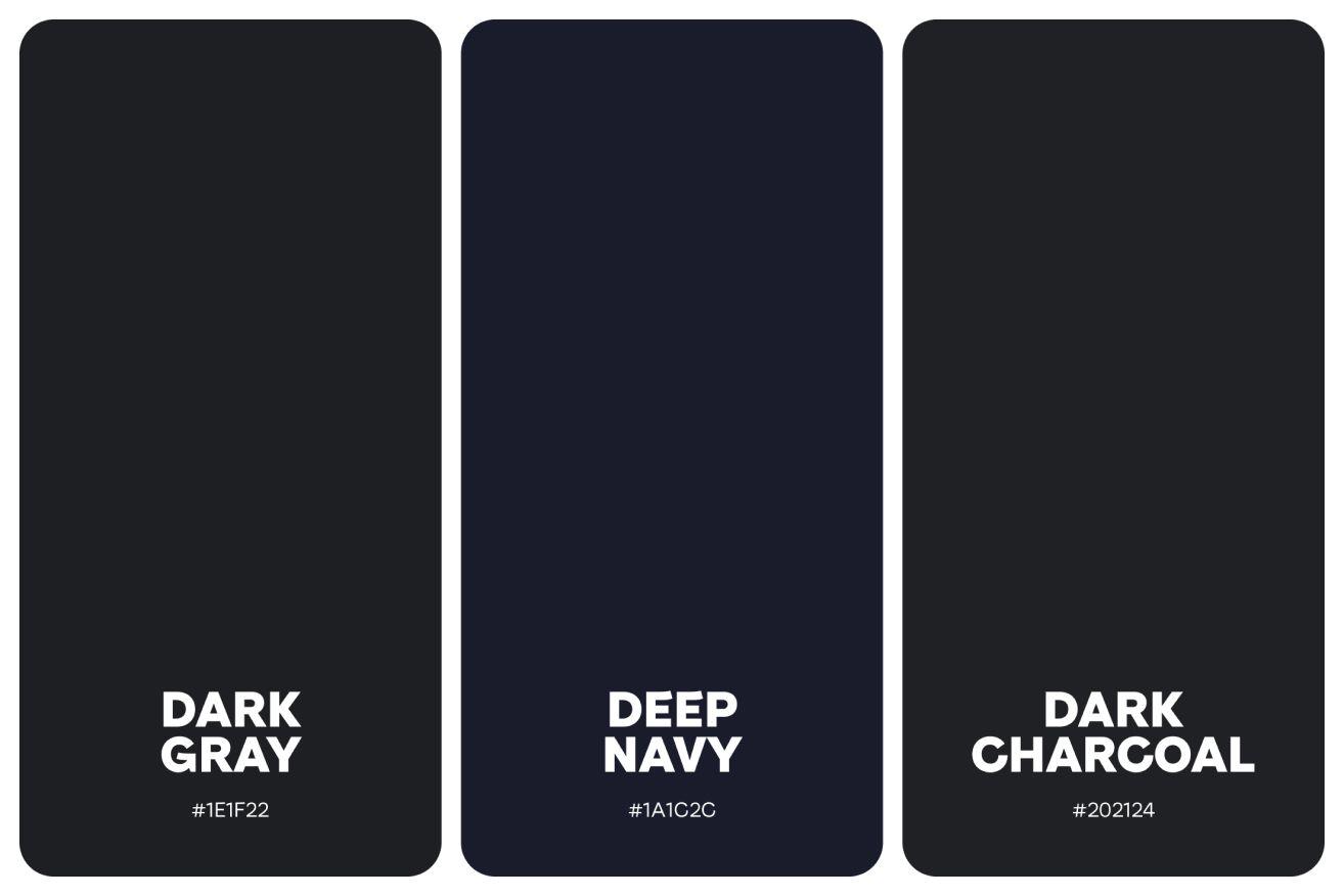
- Dark Gray: #1E1F22
- Deep Navy: #1A1C2C
- Dark Charcoal: #202124

Creating depth through elevation
One of the most challenging aspects of dark mode design is creating a hierarchy without harsh shadows. Here's how our community approaches it:
The elevation scale
Think of your interface as existing in a dimly lit room. Elements closer to the user should appear slightly lighter. Try this progression:
- Background (Base): Your chosen dark color
- Surface Level: 4% lighter than base
- Interactive Elements: 8% lighter than base
- Floating Components: 12% lighter than base
Typography in dark mode 🔠
Typography needs special attention in dark mode. The contrast between text and background becomes crucial for readability. Our community recommends:
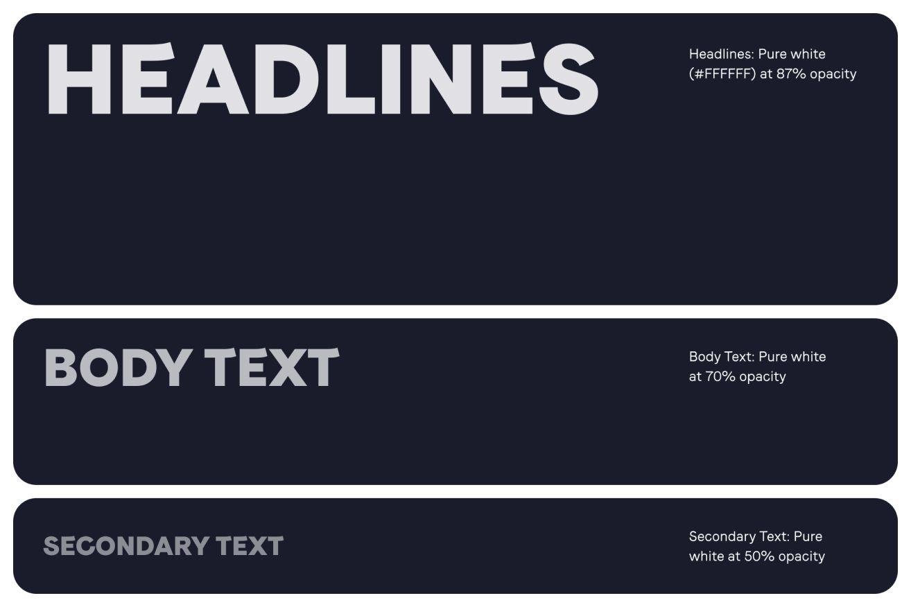
- Headlines: Pure white (#FFFFFF) at 87% opacity
- Body Text: Pure white at 70% opacity
- Secondary Text: Pure white at 50% opacity

Best practices from Fluffys 🌑
- Test your designs in different lighting conditions
- Consider how your accent colors behave in dark environments
- Pay special attention to interactive states
- Remember accessibility — maintain WCAG compliance
Looking ahead 👉
As we move into 2025, dark mode design continues to evolve. Our community is experimenting with new techniques like subtle texture overlays and dynamic color adaptation based on user preferences.
- designdesign tipsdesign inspirationmockupcursor