From ballet to branding: The story of Davka.Design
Written by
Fluffys Team
Published on March 6th, 2025
Pressure makes diamonds—or in this case, a design studio. Davka.Design wasn’t born out of comfort; it was forged through discipline, rebellion, and a need for true creative freedom. This is the story of breaking molds, defying expectations, and building a brand that refuses to blend in.
Can you share the story behind the inception of Davka.Design? What inspired you to establish your own studio?
I was born in Germany and raised in Russia (Moscow), and for as long as I can remember, my life revolved around art in one form or another. From early childhood until ninth grade, I was professionally trained in ballet, dedicating years to rigorous discipline, movement, and aesthetics. Ballet became an obsession, shaping my understanding of beauty, precision, and expression. However, when I had to leave it behind, I struggled to redefine myself outside of that world.
Seeking a new creative outlet, I pursued a degree in journalism, initially aspiring to become a film critic. Cinema and literature had always been passions of mine, but over time, the field began to feel too commercial and uninspiring. It lacked the hands-on artistic engagement I craved. My creative path took another unexpected turn when I became deeply involved in photography. My now-husband and I, whom I met at university, started a small photography studio—he was the photographer, and I took on the role of a makeup artist. This experience pulled me back into the world of color, composition, and artistic storytelling. I became fascinated with painting, mixing pigments, and learning about color theory, which ultimately laid the foundation for my future in design.
Years later, after moving to Los Angeles and becoming a mother, my perspective on career, financial stability, and personal fulfillment changed drastically. I realized that pursuing a singular passion without flexibility wouldn't be enough—I needed a skill that would allow me to create freely while maintaining stability. It was during the COVID-19 pandemic that I started exploring UX/UI design. However, it was branding and graphic design that truly captivated me. I became deeply immersed in the world of identity creation, realizing that this was where my true passion lay.
I initially worked for a large investment group, taking on significant projects, but ultimately, it wasn’t the right fit. I was then recruited by a well-known design agency, where I worked as a senior graphic designer. However, the corporate world—with its constant pressure, rigid hierarchy, and the struggle to maintain creative integrity—felt suffocating. I realized that trying to fit into this system was draining my artistic voice rather than amplifying it. I needed full creative control. That’s when I made the leap into freelancing, which ultimately led to the foundation of Davka Design.
Why “Davka”?
The name "Davka" carries deep meaning for me. In Russian, "давка" (davka) translates to "crush" or "pressure," which perfectly encapsulates my journey and the struggles I faced in the corporate world.
- Davka represents the intense competition and struggle for recognition, where people push and squeeze their way forward, trying to secure a place at the top. This is something I experienced firsthand in both ballet and the corporate design world.
- Davka embodies pressure—the constant stress and expectations to conform, which was one of the biggest reasons I left traditional work environments.
- Davka is about being forced into a mold, shaped by external forces that dictate how you should think, create, and work—something that felt suffocating to me.
- But Davka is also about resilience, force, and breaking through barriers, because real creative breakthroughs often come from struggle and resistance.
I chose this name because it perfectly reflects my personal and professional evolution—from the rigid structure of ballet and corporate life to the freedom and individuality I found in branding and design. Now, Davka Design is a space where brands develop a unique visual voice, and where design isn’t just aesthetics but a powerful tool for shaping identity.
How has your design philosophy evolved since the founding of Davka Design? Are there core principles that have remained constant?
From the very beginning, my primary principle in branding has always been problem-solving. Clients don’t come to me just for design; they come with a challenge, a question, or a need. My job is to find the right visual and strategic solution. Design is an integral part of this process, but at its core, branding is about strategy and problem-solving—understanding what needs to be communicated and how to make that message resonate through visuals.
My second core principle is the fusion of minimalism with experimentation. While a designer can't master everything or be everywhere at once, I have a strong passion for pushing boundaries, exploring new techniques, and playing with unexpected color combinations. I believe in stepping outside of traditional norms and experimenting with different effects and approaches. However, I always ensure that my work remains approachable—striking a balance between bold creativity and functional branding. Wild, avant-garde concepts may be exciting, but in branding and packaging design, they must still fit within a visual framework that aligns with the brand’s goals and audience.
I strive to follow the "less is more" philosophy but also challenge its limits. My goal is to bring something fresh and unique to branding by combining various techniques and effects to create a smart, controlled "wow" factor. It’s never about trying to please everyone; it's about making sure that every design remains commercially viable. Whether it's a lamp, a perfume bottle, or a loaf of bread, the design needs to stand out while still selling. Branding isn’t about creating an Andy Warhol or Basquiat painting—it’s not just about loud colors or striking typography. There are always rational guidelines and rules that ensure a brand’s visual identity is both compelling and effective.
Finally, my third principle is building Davka Design into a studio where brands can bring their full vision to life through various creative disciplines. In the future, I want clients to come to Davka not just for logo and packaging design, but for comprehensive branding experiences. This could include brand photoshoots, web design, or even more immersive creative collaborations. My goal is to create a space where any brand can achieve its full potential—whether through visual identity, digital presence, or physical representation.
These three principles—problem-solving, experimental minimalism, and a full-service creative approach—are the foundation of Davka Design, and they continue to shape how I approach every project.
Your work often reflects a harmony between traditional aesthetics and modern functionality. How do you approach integrating these elements into your designs?
In many ways, the answer to this question ties back to my core design philosophy. As I mentioned earlier, I love experimenting with different techniques, but the real essence of that lies in visual exploration and inspiration. My creative process is fueled by everything I see—it could be a pattern on a random piece of paper, a texture on a wall, or a forgotten vintage print. Any of these could become the next spark for a new concept or a branding direction.
Every brand has a story behind it, and that story is often rooted in tradition, origins, or cultural influences. Inspiration can come from anywhere—historical art movements, architectural details, specific eras, or even an old hand-drawn illustration. I find great joy in bridging the gap between the familiar and the new, taking traditional elements and reinterpreting them in a way that feels contemporary and approachable.
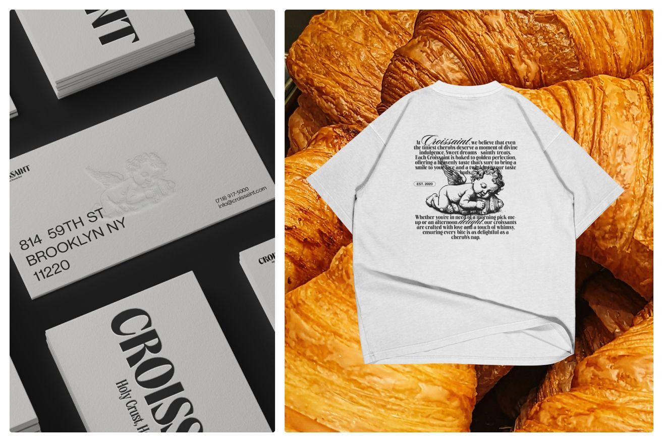
Croissant project
This approach aligns with my broader principle of ensuring that design remains engaging yet accessible. Even when referencing a specific historical period or artistic movement, the goal is to translate it into a modern visual language that resonates today. In many ways, designers act as translators or conduits, bringing past influences into the present while ensuring they remain relevant.
There's a common saying that "everything has already been created", and to some extent, I agree. But what remains for us as designers is the ability to build a bridge—to take these timeless sources of inspiration and reinterpret them in a way that makes them meaningful in the current moment.
“Behind every great designer, there isn’t just skill—there’s a unique perspective shaped by life itself. And that’s what truly makes design powerful.”
In what ways do cultural backgrounds and experiences influence the design process at Davka Design?
For me, this question is deeply connected to travel, cultural diversity, and personal experiences. I am an immigrant, and that fact alone has shaped my worldview in ways that profoundly impact my design process. From a young age, I was fortunate enough to travel extensively, thanks to my parents, who always took me along on their journeys. Those experiences shaped me as a person and, ultimately, as a designer.
Immigration itself is an act of stepping out of your comfort zone—it forces you to adapt, absorb, and navigate new environments, languages, customs, and visual cultures. Whether you realize it or not, being surrounded by different cultural elements rewires the way you perceive aesthetics, composition, and storytelling. This kind of exposure is invaluable for a designer—it broadens your understanding of how people interact with visuals across different backgrounds, industries, and markets.
I firmly believe that design is never just about tools or techniques—it’s about personality. What makes a design unique is the person behind it, their influences, and their ability to merge their experiences with creative intuition.The way I see and interpret concepts, branding, and aesthetics is a direct result of my personal journey—the places I’ve been, the cultures I’ve encountered, and the blend of my own national identity with the environment I now live in.
This melting pot of memories, cultural references, and global perspectives continuously influences my work. It merges with trends and strategy, but at its core, it’s what makes my design voice distinctive. Behind every great designer, there isn’t just skill—there’s a unique perspective shaped by life itself. And that’s what truly makes design powerful.
The Theory of Tea project showcases a unique blend of minimalism and cultural richness. Can you walk us through the creative process behind this project?
For Theory of Tea, I wanted to merge classic elements with contemporary, raw artistic techniques. I have a strong appreciation for hand-drawn, rough, almost unpolished illustrations—they carry a certain boldness and authenticity that can create an intriguing contrast when paired with structured, elegant design.
When we think of tea, especially traditional tea, our minds often associate it with classic, refined visuals—perhaps a porcelain tea set or intricate, ornate packaging. However, I wanted to reinterpret this traditional imagery through a modern lens, introducing these raw, imperfectly sketched teapot illustrations as a counterbalance to the formality we usually expect.
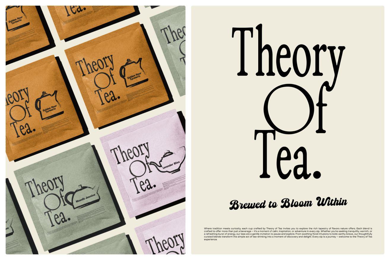
Theory of Tea project
To complement these visuals, I used a combination of typefaces that bridge heritage and modernity. The logo features a classic, condensed serif, adding a timeless feel, while the supporting typography—used for descriptions and brewing instructions—comes from Zellow Type Foundry, Pangram Pangram, and Brandon Nickerson, all of which I love working with. This mix allowed me to balance readability with personality, ensuring that while the design feels fresh and unexpected, it remains accessible and legible.
The overall goal of the project was simple: to explore raw, hand-drawn illustrations and integrate them into a structured layout that feels both classic and contemporary. The interplay between experimental visuals and structured typography creates a unique balance—one that makes Theory of Tea stand out while still feeling familiar and inviting.
HappyJoy is a project that exudes joy and positivity. What inspired this concept, and how did you translate that into the design elements?
First, it's important to note that the concept itself is not originally mine—it comes from the amazing design community at Modern Brief, a platform I deeply admire and often participate in. They provide weekly creative briefs, allowing designers to experiment and push their skills in branding and packaging. Early in my career, working on conceptual projects like this was how I built my portfolio, and I still enjoy engaging in these challenges whenever I can.
For Happy Joy, my goal was to create something that felt bold, unconventional, yet completely sellable as a real product. This ties back to my core design philosophy—balancing experimentation with commercial viability. I wanted to step outside the typical aesthetic of snack branding while ensuring that the product still looked desirable on the shelf.

HappyJoy project
One of my favorite aspects of branding is customizing typography, and I rarely leave type untouched. For this project, I worked with Shedry Variable, adjusting the weight and breaking the wordmark into two parts. The key idea behind the logo was to embed a subtle, playful visual cue—by modifying the letters, I created a smiling face effect. The half-circle of the "O" combined with the two "P" characters forms an abstract wink, reinforcing the concept of joy and happiness in a way that feels effortless and memorable.
To further emphasize the fun, lighthearted nature of the brand, I used punchy, high-contrast colors and raw, dynamic graphic elements. The jagged break in the text and the playful, almost dancing movement of the typography create an energy that feels spontaneous yet intentional. The irregular, torn edges of certain design elements add a tactile, imperfect quality, making the branding feel personal and full of character. Overall, Happy Joy was about creating an identity that feels as cheerful and inviting as its name—something simple yet expressive, minimal yet full of personality.
Charley Sparkling Water features a colorful, minimalistic mascot and packaging that stands out. Can you share the story behind Charley's character design and how it embodies the brand's mission to redefine relaxation?
Charley Sparkling Water is one of my personal favorite concepts, inspired by the work of Fred Trevor, who designed Loah Beer. With this project, I wanted to take a bold, unconventional approach—not just in branding but also in packaging format. Instead of traditional soda cans or bottles, I imagined large, one-liter metal canisters. This instantly makes the product stand out on the shelf, creating an immediate wow effect. The idea was to challenge the conventional perception of sparkling water—why not package it like an industrial, heavy-duty product? This unexpected twist turns a simple beverage into an object of intrigue.
The mascot plays a crucial role in defining the brand’s identity. I deliberately kept the character’s pose unchanged across all flavors but experimented with color variations, making the top of their outfit reflect the drink’s flavor—red for cherry, green for lime, mustard yellow for ginger. This approach creates consistency while still allowing for distinction between different flavors.
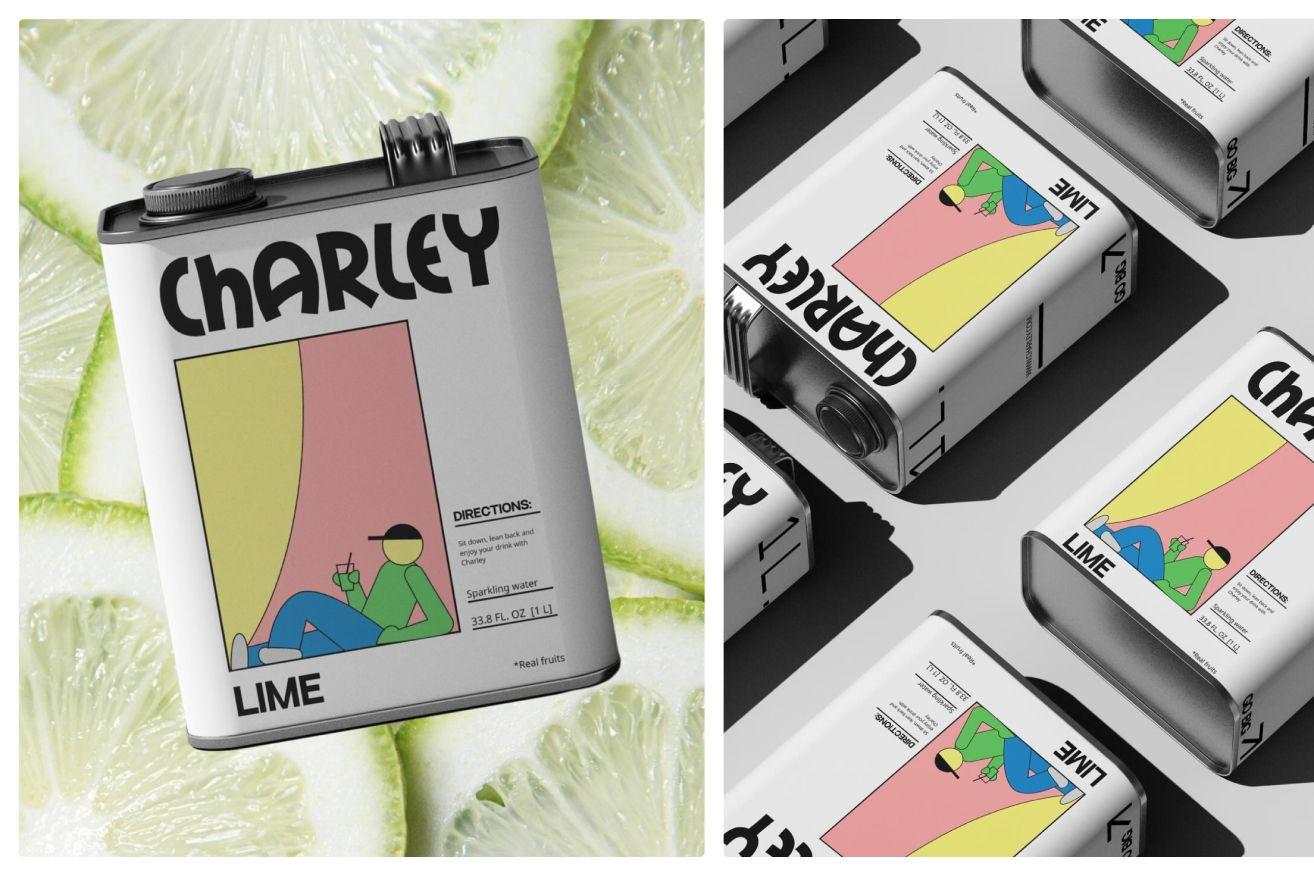
Charley project
Visually, I wanted to merge retro aesthetics and comic book elements with modern minimalism. The illustration style is playful yet structured, evoking a nostalgic but fresh feel. The contrast in typography further enhances this balance—I used a bold, expressive, slightly quirky font for the logo, while pairing it with a clean, geometric grotesque for the flavor descriptions and product details. This interplay between structured and playful elements, combined with bold color blocking and a restrained yet vibrant layout, makes the design memorable, eye-catching, and unique.
Beyond just design choices, the laid-back, relaxed, "chill" aesthetic is something I deeply admire and connect with on a personal level. I’m naturally a chill person, and I appreciate this feeling in everything—from film to painting to design. I’m drawn to raw, unpolished, lazy-but-intentional aesthetics, where things feel effortless and natural rather than overly refined or forced. That’s exactly what I wanted to capture with Charley—a brand that doesn’t take itself too seriously, that embodies a slow-living, relaxed attitude while still being visually strong and commercially appealing.
Overall, Charley Sparkling Water embodies effortless relaxation—the laid-back, minimalist mascot, the oversized industrial canister, and the bold yet playful design all come together to create a brand that feels both refreshing and rebellious at the same time. It’s a mix of unexpected details and deliberate simplicity, making it an experience, not just a drink.
Mellow suggests a sense of calm and relaxation. How did you approach the design to evoke these feelings, and what specific elements contribute to this ambiance?
First and foremost, Mellow is about marshmallows—a delicate, airy, pillow-like sweets. When developing the packaging concept, I envisioned how to visually translate its softness into a tangible design experience. The idea for the blocky typeface from the amazing Tropical Type Foundry suddenly clicked, as it immediately reminded me of the fluffy, cloud-like texture of marshmallow. In a way, these soft, white, pillowy treats resemble actual cushions, which inspired the entire aesthetic of this project.
I wanted the design to feel as soft as the product itself—to create a pillow effect that subconsciously evokes comfort and indulgence. Design is not just about aesthetics; it’s about emotional impact. The best packaging works when it doesn’t just sell a product but evokes a feeling—that moment when a person sees a package and instinctively connects with it on a sensory level.
This is a powerful strategy. When packaging doesn’t just communicate flavor but also triggers a sensory or emotional reaction, that’s when you achieve real engagement. Humans are wired to remember tactile experiences, nostalgic sensations, and emotional responses—which is exactly what Mellow aims to tap into.
Every design choice here was intentional—from the typefaces that mimic softness to the overall composition that reinforces the idea of pillows and pastila’s light, airy texture. The goal was to make the visual experience immediately translate into a taste expectation—creating a seamless emotional and sensory bridge between what you see and what you’re about to experience.
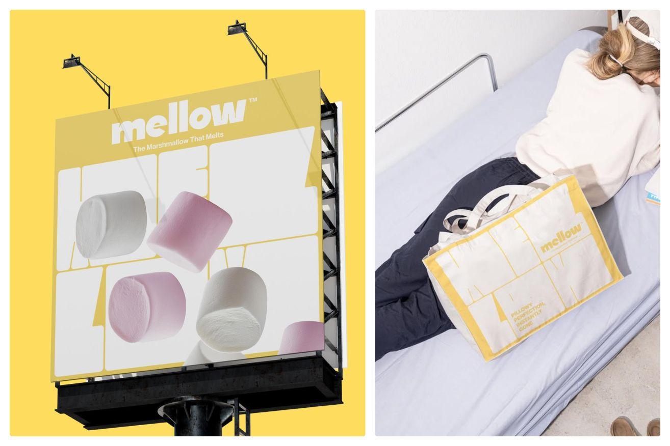
Mellow project
Were there any particular challenges in ensuring that Mellow stood out in a market saturated with similar products? How did you address them?
The answer to this question ties directly to the previous one—because at its core, Mellow was always about strategy, not just aesthetics. Yes, the color palette of yellow and white is a frequent choice in candy and confectionery packaging. Yes, bold typography is a familiar branding tool. But what made this project distinct wasn’t just the colors or the type—it was the emotional connection I aimed to create.
My goal wasn’t just to make another visually appealing package but to trigger a subconscious sensory response. I wanted to tap into the muscle memory of softness, of pillows, of comfort, making the typography not just a logo but an extension of the product’s texture. By mirroring the logo in another typeface, I reinforced this idea—turning something ordinary into something distinctive.
This approach helped me bypass the challenge of an oversaturated market. Yes, there are plenty of pastel-colored, minimalist snack packages out there. But few actually evoke a specific physical sensation in the way Mellow does. That’s where the difference lies—not just in how it looks, but in how it makes people feel.
How does Davka Design approach client collaboration to ensure the final design aligns with their vision while incorporating your creative expertise?
While the branding process is rarely a perfectly smooth journey, the key challenge lies in the fact that design is inherently subjective. A brand identity begins with strategy and visuals, but for the process to truly work, these two elements must merge seamlessly in both the client’s mind and the designer’s. My role is to make a subjective process objective—to bridge the gap between how a client envisions their brand and how it should be strategically and visually translated into the real world.
This is why collaboration is essential. From the very first onboarding call to the moodboarding phase—which, in my process, consists of two distinct moodboard concepts instead of just one—I prioritize deep research into the behind-the-scenes aspects of the brand. My goal is to extract as much relevant information as possible, uncover unique details that might later become defining elements of the identity, and tap into the emotional and strategic layers that the client may not have initially considered.
A detailed questionnaire and an in-depth brand conversation set the foundation. Once the client sees their brand strategy in action—through competitor audits, moodboarding, and early explorations—they begin to trust the process more. Trust is the key. The more structured and thorough these initial steps are, the more confidence the client has in my expertise, which ultimately allows me to lead the creative direction with strategic reasoning rather than just aesthetics.
Once trust is established, collaboration turns into a true partnership. This is where my expertise allows me not just to execute a vision but to guide the client, challenge their assumptions when needed, and shape the identity in a way that balances both strategy and creativity.

NÔM project
In the ever-evolving design landscape, how does your studio stay current with trends without compromising its unique style?
No matter how often people say that trends don’t matter, the reality is that they shape industries on a massive scale. Entire design and fashion giants dictate seasonal shifts in color, typography, composition, and aesthetics. Trends are not just fleeting waves—they set the tone for visual culture, and ignoring them would mean falling behind in an industry that is constantly evolving.
However, the key is not in blindly following trends but in understanding them and using them to your advantage. The real challenge is to have a strong personal style while still knowing how to reinterpret trends in a way that feels authentic and beneficial to your creative approach. It’s about striking a balance—adapting without losing your identity.
For me, visual exploration and awareness are critical tools. I believe in staying constantly immersed in what’s happening in design, branding, and culture at large. Looking around, observing, analyzing—these are fundamental habits. You have to understand the visual language of the present to extract what resonates with you and turn it into something uniquely yours. Trends are a tool, not a rulebook, and when used correctly, they elevate rather than dictate your creative direction.
What role does sustainability play in your design projects, and how do you incorporate eco-friendly practices into your work?
Sustainability in design is a complex and multifaceted topic, and I believe it’s important to approach it pragmatically rather than superficially. While not every project allows for a fully eco-conscious approach—especially when working with existing brands and their established production processes—there are ways to integrate sustainability at different levels.
For me, sustainability in design comes down to intentional choices:
- Thoughtful Material Selection – Whenever possible, I encourage the use of recycled, biodegradable, or responsibly sourced materials for packaging and printed assets.
- Minimalist & Functional Design – A well-designed brand identity should stand the test of time, avoiding excessive redesigns that lead to waste. This is where my principle of "less but better" plays a role—creating designs that don’t rely on unnecessary embellishments but still feel fresh and innovative.
- Efficiency in Production – Making strategic design decisions that minimize excess ink usage, unnecessary embellishments, or overly complex structures can have a significant impact on the sustainability of a product.
- Digital-first Approach – Encouraging brands to shift towards digital solutions when applicable—such as interactive brand guidelines, digital marketing over print-heavy campaigns, or eco-conscious packaging alternatives.
Sustainability in design isn’t just about choosing the "greenest" option available—it’s about making intentional, informed decisions that balance aesthetics, brand identity, and long-term environmental responsibility.
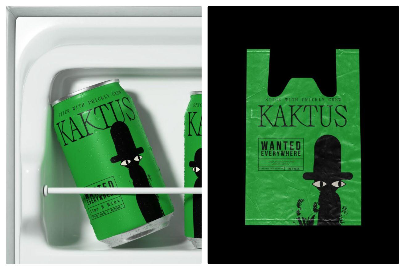
KAKTUS project
“Observe. Absorb. Be curious. There is inspiration in everything—you just have to be open to seeing it.”
Can you share strategies you employ to overcome creative blocks during the design process?
Honestly, I haven’t experienced a major creative block yet—at least not in a way that has completely stopped my work. Maybe that moment will come in the future, but for now, I think it’s because I don’t limit my life exclusively to branding and identity design. Yes, design is a huge part of my world, and as my client base grows, it takes up more and more space in my daily life. But at the same time, I believe that to stay creative, you have to actually live life—you have to constantly absorb inspiration from the world around you.
For me, inspiration isn’t just about design-related things. It comes from everywhere:
- Cinema – Film has always been an endless well of inspiration for me. The combination of storytelling, cinematography, set design, and lighting creates a deep visual language that often sparks ideas in unexpected ways.
- Fashion – The way fashion evolves, plays with structure, and interprets trends is a powerful creative reference point.
- Nature – Colors, textures, and compositions found in nature often translate beautifully into branding and design.
- Books & Visual Research – Pinterest, mood boards, and even printed design books always help to train the eyeand build a natural visual vocabulary.
- Travel – This is probably my biggest creative reset. Travel has been a core part of my life since childhood, and it remains the ultimate way for me to refresh my perspective. Seeing new places, cultures, and ways of life is a direct trigger for new ideas. It forces you to look at the world with fresh eyes, and that naturally extends into creative work.
- My Baby – Watching my baby grow has been one of the most unexpected and beautiful sources of inspiration. Everyday is a learning experience for her, and seeing the world through her eyes reminds me that creativity is about curiosity, exploration, and embracing the unfamiliar. Her approach to the simplest things—whether it's colors, textures, or movement—is a constant reminder that design, at its core, is about discovery.
In short, the key to avoiding creative blocks is to never stop looking. Observe. Absorb. Be curious. There is inspiration in everything—you just have to be open to seeing it.
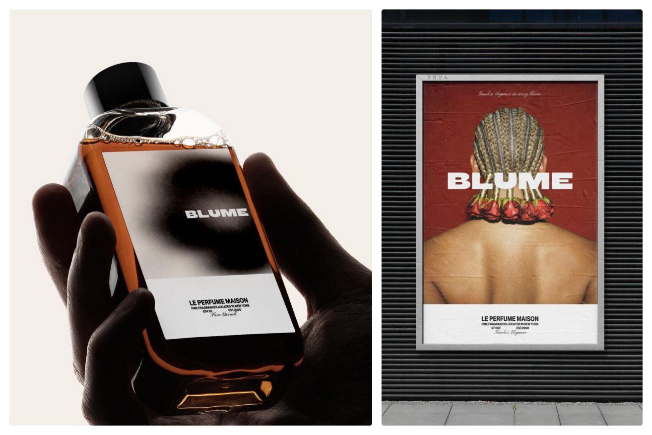
Blume project
What are your aspirations for the future of Davka Design? Are there specific projects or collaborations you envision?
I have many aspirations, but they all revolve around growth, collaboration, and expansion. My goal is not just to grow as a designer, but to grow Davka.Design into a broader creative studio that offers a wider range of services while maintaining a strong focus on branding.
One of my biggest priorities right now is expanding into web design. I’m not someone who wants to do everything alone—I believe in delegation and collaboration. There are so many talented creatives out there who specialize in areas that I may not, and I see great value in working with people who excel in their craft. The future success of Davka Design, in my opinion, lies in building a strong network of specialists, allowing us to offer more while ensuring that every project is executed at the highest level.
Another key goal is to start offering branded photoshoots as part of the studio’s services. Branding is more than just a logo or packaging—it’s a full experience, and I want to be able to provide clients with everything they need to bring their vision to life, including high-quality visual content that complements their brand identity. This is a major priority for me as my client base continues to grow with more exciting and ambitious projects.
Beyond that, I have a bigger, long-term vision. I’m not focused on awards or industry recognition—I’m focused on creating something truly impactful. Every designer dreams of disrupting the world of packaging or graphic design in a way that leaves a lasting impression, and I’m no different. Right now, it’s about honing my craft, refining my process, and maintaining a strong client base. But ultimately, I want to take things to the next level—to work on bigger projects, more exciting collaborations, and to build Davka Design into something larger than just myself. The goal is expansion—more clients, more creative partnerships, more services, and a studio that continues to evolve.
“The key is to understand your unique strengths, your key priorities, and what makes you stand out.”
What advice would you offer to emerging designers aiming to establish their own studios in today's competitive environment?
This is a question I find incredibly important. My biggest piece of advice? Stop looking for answers in other designers. Stop waiting for someone to tell you how to do it. The truth is, if you want to start your own studio, the answers won’t come from someone else—they have to come from you.
The key is to understand your unique strengths, your key priorities, and what makes you stand out. What do you do best? What can you offer that others can’t? Find that and learn how to sell it.
Another crucial skill that many designers struggle with—including myself sometimes—is communication. Designers are often naturally introverted, and I’m no exception. I don’t enjoy being in the spotlight, and for me, putting myself out there has been a challenge. But the reality is, if you want to build a studio, you have to learn to talk to clients, to articulate your value, to sell your ideas. Getting out of your comfort zone is essential.
Then, there’s visual awareness—something I strongly believe in. Consume as much as possible—not just design-related content, but everything: art, film, fashion, nature, architecture, books. Absorb everything you see. Learn without asking. Just watch. Observe. See how things are done. There are endless resources out there—YouTube, courses, case studies—polish your skills, master your tools, and refine your process.
Finally, stop constantly comparing yourself to others. It’s inevitable, I know, and in some ways, competition can be motivating. But if you spend too much time looking sideways, you risk blending into the crowd. The goal is to pull yourself out of that crowd—to define what makes you unique and lean into it. And the only person who can figure that out for you—is YOU.
- designdesign tipsinterviewmockupcursor