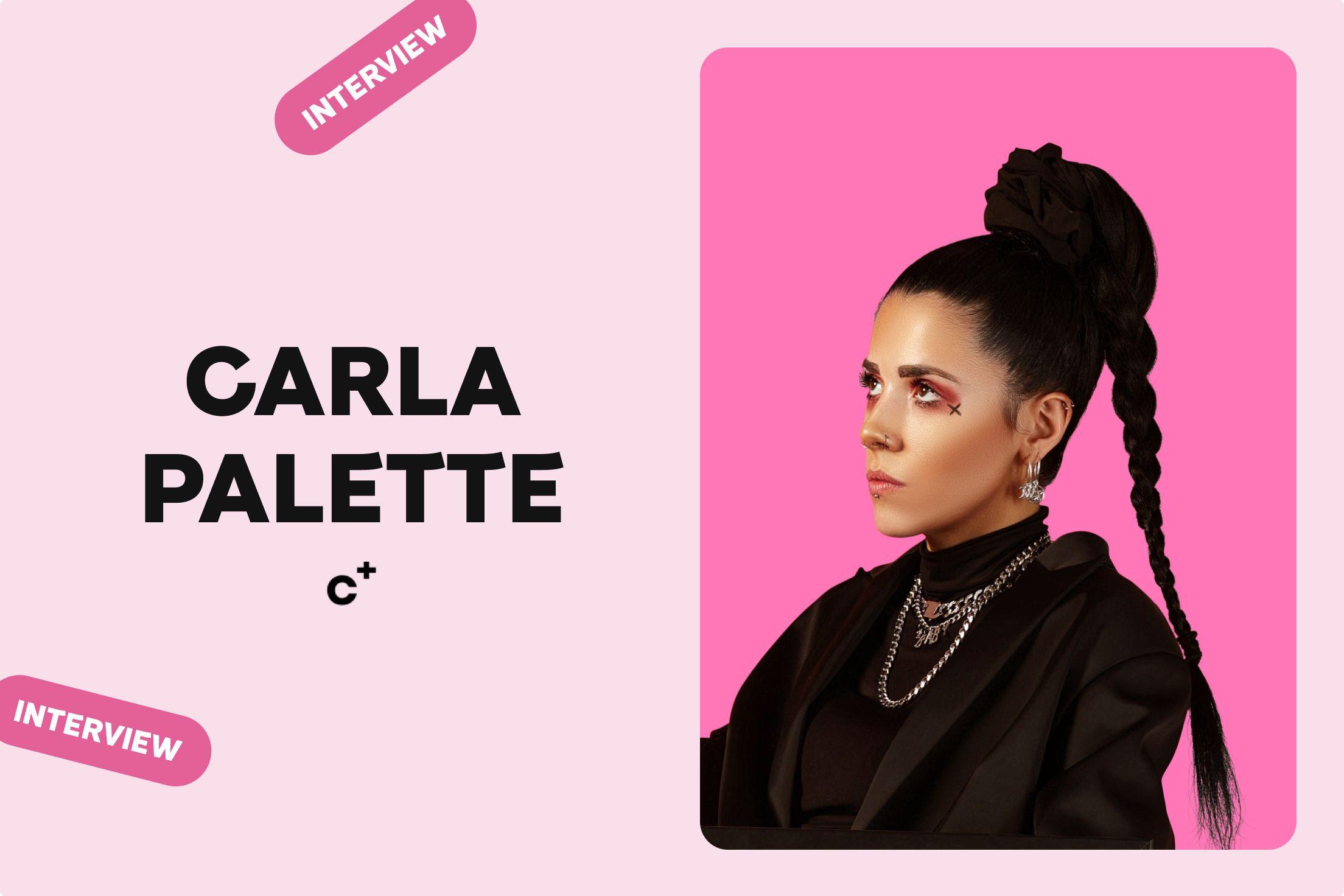
Bold by design: Carla Palette's creative vision
Written by
Fluffys Team
Published on February 20th, 2025
Carla Palette approaches design with sharp intention. Her work challenges expectations, balancing precision with bold ideas. In this interview, she shares insights on her latest projects, the decisions behind them, and how she shapes brands with lasting impact.
](/_next/image?url=https%3A%2F%2Ffluffysblob.blob.core.windows.net%2Ffluffys-blob-stg%2Fuploads%2Fwhine_fluffys_5bbba80133.jpg&w=3840&q=75)
Every designer has a moment where they realize they see the world differently. What was yours?
Every designer has that defining moment when they realize they perceive the world differently. For me, it came early in my career. I started at 18, working in car advertising and corporate design at a very entry-level position. For years, I felt out of place, like a square peg in a round hole. I struggled to fit into the traditional mold of what a designer should be, and it often felt like my unique perspective was met with resistance. At one point, I even questioned if design was the right path for me. But I decided to take a risk and go solo, giving it one last try. That’s when I began freelancing with lifestyle brands—work that truly resonated with my style and was open to my approach to design.
Your work is fearless—it embraces bold color, tension, and contrast. Do you remember the first time you pushed beyond what felt ‘safe’ in design?
The first time I really pushed beyond what felt ‘safe’ in design was when I broke away from the corporate world, where people-pleasing was often the only way to get things done. Once I went solo, I started experimenting with color in ways that felt bold and unexpected. Before, I had stuck to what was “safe” and “acceptable,” but now, I took risks with every project. I embraced unorthodox color combinations and social tensions that were both daring and unpredictable. It was incredibly freeing, sparking a newfound creativity in me. I realized that leaning into this tension and contrast not only created a powerful visual energy but also felt like my true design voice. That moment gave me the confidence to continue pushing boundaries and step beyond my comfort zone.
Did you always intend to create work that provokes and challenges, or did that evolve over time?
It definitely evolved over time. In the beginning, I was focused on simply mastering the technical aspects of design and following conventional expectations of what my corporate clients wanted. But as I gained more experience and started to develop my own voice, I began to realize that design could be so much more than just people pleasing visuals. I wanted to create work that sparked emotion, questioned norms, and pushed people to think differently. That shift happened gradually, as I started experimenting more and stepping out of my people pleasing mentality. Now, it’s about using design to provoke thought, create dialogue, and challenge the status quo. It’s an ongoing journey of discovering how far I can take it.
Your work seems to exist in a space where art, design, and identity collide. Do you see yourself as a designer, an artist, or something in between?
I definitely see myself as existing somewhere in between. I don’t like to limit myself to just one label, because my work is an intersection of design, art, and identity. As a designer, I’m focused on creating solutions and experiences that serve a purpose, but at the same time, I’m deeply inspired by art to push the boundaries of what design can express. My work is personal—it’s a reflection of my own identity, and I believe that design and art are powerful ways to communicate who we are and what we believe in. So, for me, it’s less about being one or the other and more about embracing both sides to create something that’s visually impactful and deeply meaningful.
](/_next/image?url=https%3A%2F%2Ffluffysblob.blob.core.windows.net%2Ffluffys-blob-stg%2Fuploads%2Flokol_fluffys_70b428995b.jpg&w=3840&q=75)
You’ve said that you have an “affliction for colour and controversy.” What’s the most recent project where you used colour to disrupt or challenge perception?
The most recent project where I used color to challenge perception was for a branding campaign I worked on with a lifestyle brand. I intentionally chose a color palette that was unconventional for the industry—using a mix of bold, clashing colors that you wouldn’t typically see in this space. I wanted to disrupt the typical color schemes that felt safe and expected. The goal was to create a visual tension that made people stop and take notice, pushing them to reconsider how they viewed the brand and its message. It wasn’t about pleasing everyone, but about sparking conversation and forcing people to engage with something new and different. The response was incredible, with people talking about how the colors made them feel a certain way, which was exactly what I wanted to achieve.
“My goal is always to build something fresh and unique, not just replicate what’s already out there.”
When you work on a brand identity, are you creating an identity that already exists but hasn’t been visually expressed yet—or are you building something entirely new?
I don’t think it’s effective to simply recreate an identity that already exists. In every project, I conduct a competitor audit to identify common trends and patterns within the market. I then use this insight as a springboard to create something that challenges the expected norms and stands out. My goal is always to build something fresh and unique, not just replicate what’s already out there.
What’s a design rule you completely ignore?
One design rule I completely ignore is the idea that "less is more." While simplicity has its place, I often embrace complexity, especially when it comes to color, contrast, and visual tension. I believe that design should evoke emotion and create an impact, even if it means going against the grain. Sometimes, layering elements, bold contrasts, or adding unexpected details can create a more dynamic and memorable experience than a minimalistic approach. For me, design is about pushing boundaries, not always adhering to conventional rules.
What’s a recent project where you had to fight for an idea?
A recent project where I had to fight for an idea was for a rebranding of a lifestyle brand called Dabble. I proposed a bold, unconventional visual direction that incorporated high-contrast colors and disruptive typography. The client initially pushed back, feeling it was too risky and not in line with their established image. I had to advocate for the idea by explaining how it could challenge the norms in their industry and help them stand out in a saturated market. After presenting research, competitor audits, and examples of how this approach would engage a wider audience, they came around. In the end, the result was exactly what the brand needed—something fresh, edgy, and true to their evolving identity.
Most projects I need to fight for an idea in one way or another.
](/_next/image?url=https%3A%2F%2Ffluffysblob.blob.core.windows.net%2Ffluffys-blob-stg%2Fuploads%2FKihara_fluffys_1852ba2a77.jpg&w=3840&q=75)
KIHARA is an international, interdisciplinary hub—a brand that seems to defy singular definition. How do you design for something that is, by nature, fluid?
Designing for something as fluid and multifaceted as KIHARA requires embracing flexibility and adaptability. The brand itself is constantly evolving, and its identity spans multiple disciplines and cultures, so my approach is to create a visual language that is both dynamic and versatile. Instead of sticking to a rigid formula, I focus on creating a foundation that can shift and transform while staying true to the brand's core values. This means using a modular design system, with adaptable elements that can evolve over time, yet still maintain coherence. It's about designing with space for growth and change, while ensuring that every iteration feels authentic and connected to the brand’s essence. Ultimately, the design has to be as fluid as the brand itself, capturing its spirit of innovation and interdisciplinary nature.
](/_next/image?url=https%3A%2F%2Ffluffysblob.blob.core.windows.net%2Ffluffys-blob-stg%2Fuploads%2FTresi_fluffys_b70519d55f.jpg&w=3840&q=75)
With Tresi, you created a visual identity for a brand that deals with history—objects that have already lived before. How do you design something that respects the past but still feels new?
Designing for a brand like Tresi, which works with objects rich in history, requires a delicate balance of honoring the past while bringing something fresh and contemporary to the table. The key is to find visual elements that echo the essence of history—whether that’s through texture, form, or typography—while incorporating modern design principles to make it relevant today. For Tresi, I drew inspiration from historical references but paired them with minimalist and clean design choices, creating a bridge between the old and new. This way, the identity feels timeless yet forward-thinking. It’s about respecting the legacy of the objects while reimagining how they’re presented in a way that resonates with today’s audience. The challenge is to ensure the design speaks to both history and modernity without one overshadowing the other.
](/_next/image?url=https%3A%2F%2Ffluffysblob.blob.core.windows.net%2Ffluffys-blob-stg%2Fuploads%2FSnug_fluffys_f16297e64f.jpg&w=3840&q=75)
Let’s talk about SNUG. SNUG doesn’t look or feel like any other condom brand—it’s confident, playful, and deliberately breaks the usual design tropes. What was the core idea behind this approach?
The core idea behind SNUG’s approach was to create a bold, unapologetic, and culturally sharp condom brand that speaks directly to an audience often overlooked in the category. Instead of playing it safe with clinical messaging or hyper-masculine branding, SNUG leans into a cheeky, politically charged, and subversive tone—one that challenges norms, sparks conversation, and makes a statement.
At its heart, SNUG is about reclaiming power—flipping the script on how gender, sexuality, and size have historically been talked about in mainstream culture. By using feminine-coded aesthetics like bold pink and pairing them with punchy, in-your-face typography, the brand visually and verbally disrupts the traditional male-centric condom industry. The messaging doesn’t just cater to big fits—it playfully reclaims the same objectification that women and femme-identifying individuals have long endured, turning it into a tool for empowerment.
The humor and confidence in SNUG’s voice make the brand feel fun, inclusive, and effortlessly cool. It’s not just selling condoms—it’s selling a cultural moment, a fresh perspective, and an attitude that resonates with the girls and the gays. The tagline “Feminism paying off in unlikely ways” encapsulates this, proving that equality isn’t just serious business—it’s something to be enjoyed, celebrated, and even profited from in the most unexpected ways.
Ultimately, SNUG’s approach is about making a statement while making people smile. It’s a condom brand that doesn’t whisper—it shouts, flirts, and takes up space in a way that feels fresh, culturally relevant, and impossible to ignore.
](/_next/image?url=https%3A%2F%2Ffluffysblob.blob.core.windows.net%2Ffluffys-blob-stg%2Fuploads%2Fsnugsnug_fluffys_b1b10eb590.jpg&w=3840&q=75)
What’s the one thing you hope people feel when they see SNUG on a shelf?
The one thing I hope people feel when they see SNUG on a shelf is humour. I want them to feel curious, intrigued, and even a little playful. SNUG’s design breaks the usual mold, so I want it to stand out in a way that makes people think, ‘wow that’s one for me’ It’s about creating a sense of comfort and approachability while also conveying unapologetic confidence and humour. Ultimately, I hope it sparks a positive, confident feeling - it’s not just a product, but something that makes the experience feel a little more fun and engaging.
](/_next/image?url=https%3A%2F%2Ffluffysblob.blob.core.windows.net%2Ffluffys-blob-stg%2Fuploads%2Fromeos_fluffys_ff01e3c60a.jpg&w=3840&q=75)
The logo process for Romeo’s was a journey, with multiple iterations. What was the biggest challenge in getting it just right? And what finally made you say, ‘This is it’?
The biggest challenge in designing the Romeo’s logo was striking the perfect balance between _approachability and character. _The logo needed to feel down-to-earth yet distinctive, simple yet full of personality, and most importantly, timeless yet fresh.
Throughout the process, multiple iterations explored different weights, letterforms, and customizations—some felt too refined and polished, losing the casual charm of a neighborhood deli, while others leaned too playful, missing the sense of quality and craftsmanship that defines Romeo’s. Finding that sweet spot was a process of refining, testing, and adjusting—ensuring that every curve, weight, and spacing choice contributed to the effortless yet intentional feel of the brand.
The ‘this is it’ moment came when the logo fully embodied Romeo’s ethos—bold but unpretentious, classic with a subtle modern edge. The final design captured the essence of the brand: a sandwich shop that doesn’t try too hard but still gets everything just right. It felt effortless, confident, and instantly recognizable—just like a great sandwich should be
](/_next/image?url=https%3A%2F%2Ffluffysblob.blob.core.windows.net%2Ffluffys-blob-stg%2Fuploads%2Fromeosberlin_fluffys_925c948c02.jpg&w=3840&q=75)
Romeo’s has a bold, graphic-driven identity that feels both modern and nostalgic. Was there a specific era, culture, or reference point that shaped its visual direction?
Yes, the visual direction for Romeo’s drew inspiration from a blend of mid-century modern design and the bold, graphic styles of the 80s. I wanted to create something that felt timeless but with a contemporary edge. The mid-century modern influence brought in a sense of clean lines and simplicity, while the 80s reference added a playful, graphic intensity—think vibrant colors, sharp angles, and strong contrasts. It was about capturing the energy of those eras while ensuring the identity felt fresh and relevant for today’s audience. Romeo’s needed to evoke a sense of nostalgia, but without relying on clichés—something that felt both new and familiar at the same time.
](/_next/image?url=https%3A%2F%2Ffluffysblob.blob.core.windows.net%2Ffluffys-blob-stg%2Fuploads%2Fmaison_fleuret_fluffys_d8a5fef7dc.jpg&w=3840&q=75)
Can you discuss the visual narrative you crafted for Maison Fleuret? How do the design elements across different touchpoints (e.g., the coffee shop, hotel, baking school) tell a unified story?
The visual narrative of Maison Fleuret is built on timeless sophistication, authenticity, and understated luxury, ensuring a cohesive experience across all brand touchpoints, from the coffee shop and baking school to the hotel and estate. The custom FT Sterling wordmark and type system establish an elegant yet neutral foundation, while hand-drawn illustrations subtly reinforce the brand’s connection to traditional craftsmanship without compromising its timeless aesthetic. A color-coded and numeric packaging system helps distinguish product offerings, enhancing recognition and ease for customers. Beyond graphics, the brand identity extends into physical spaces, where materials, textures, and spatial design reflect the same refined minimalism, ensuring a seamless experience across signage, menus, and packaging. This carefully curated approach weaves together typography, color, illustration, and materiality, creating a cohesive and immersive brand experience that embodies heritage, craftsmanship, and sophistication at every touchpoint.
](/_next/image?url=https%3A%2F%2Ffluffysblob.blob.core.windows.net%2Ffluffys-blob-stg%2Fuploads%2Fmaisonfleurett_fluffys_bafe531220.jpg&w=3840&q=75)
What were the primary challenges you faced in branding such a multifaceted establishment, and how did you overcome them to ensure a harmonious brand experience?
Branding Maison Fleuret required balancing cohesion and flexibility across its diverse subcategories—coffee shop, bakery, hotel, estate, and product line—while maintaining a refined, unified identity. The key challenge was ensuring visual consistency without restricting each subcategory’s unique expression. To achieve this, we implemented a minimal yet adaptable typographic system using FT Sterling, providing continuity across all touchpoints.
To differentiate products while maintaining brand harmony, we developed a color-coded and numeric packaging system, enhancing recognition and shelf presence. Illustrations were introduced as a secondary, adaptable element, ensuring the brand remains timeless rather than trend-driven.
By focusing on a flexible, structured design system, we created a brand experience that is sophisticated, cohesive, and easily navigable, ensuring Maison Fleuret’s identity remains both distinctive and enduring across every touchpoint.
" I want my work to feel at home in its time, yet strong enough to live beyond it."
Do you ever feel disconnected from past projects, like they no longer represent who you are as a designer today?
Absolutely. It’s almost inevitable as a designer. The work that once felt like a perfect representation of my vision now feels like an artifact of a past version of myself—like looking at an old photo where you barely recognize your own style.
Design is so tied to growth that it’s natural to outgrow past projects. It’s not that they were bad (though sometimes, looking back, there’s a cringe factor). It’s more that they captured a specific mindset, aesthetic, or level of skill at the time. But with every new project, every experience, and every evolution in taste, your standards shift.
There’s also the reality that design is for clients, not just for yourself. Some past projects might have been successful, but if they don’t align with where you are creatively now, they can feel distant—like work someone else made. The disconnection can be frustrating, but I see it as proof of progress. If I still felt 100% aligned with what I created five years ago, that would mean I hadn’t evolved. The challenge is embracing that growth while still respecting the work for what it was: a step toward what’s next.
If you had to destroy and rebuild your creative practice from scratch, what’s the one thing you’d keep?
If had to rebuild my creative practise the one thing I would keep is my personal brand, which has taken some time to define, strengthen and own.
When you imagine the future, what do you hope your work stands for?
When I imagine the future, I hope my work stands for clarity, intention, and lasting impact. I want it to be more than just visually compelling—I want it to feel inevitable, like it was always meant to exist that way.
I hope it represents a balance between intellect and instinct—design that isn’t just beautiful but also deeply considered, with a reason behind every choice. I want my work to have a signature presence, not because it follows a rigid aesthetic, but because it carries a distinct point of view—something that feels unmistakably refined, yet alive.
I also hope it stands for cultural resonance—not just following the pulse of the moment, but shaping it. I want my work to feel at home in its time, yet strong enough to live beyond it.
More than anything, I want it to leave an imprint. Not just on a brand or a campaign, but on the way people experience design—where something I’ve created shifts their perception, even if only slightly. If my work can make people feel something, rethink something, or see something differently, then it has done its job.
- designdesignerdesign inspirationinterviewmockupcursor